
Quick note from Metacoda: This is a blog post by Anindra Iswara, a graduate from University of Queensland currently undertaking a Master in Computer Science. Anindra was employed by Metacoda as part of the SAS® Work Placement Program over the summer break (December 2013 – February 2014) and these are her “things that matter” (4 tips) on what she learned. You can read about her internship here
Now over to Anindra …
During my part-time summer internship, I had the opportunity to use four SAS Software products: SAS® Enterprise Guide® 6.1, SAS® Data Integration Studio 4.7, SAS® Enterprise Miner and Text Miner 12.3 and SAS® Visual Analytics 6.3. I understand my exposure to the software was for a short period of time, and I don’t claim to be an expert, however I’d like to share a few simple tips I found really important as a new SAS user. Below is a tip from my use with each product.
SAS Data Integration Studio Tip
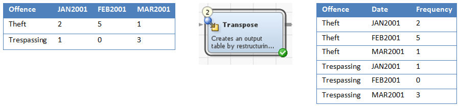
In my limited exposure to SAS Data Integration Studio I found the transpose transformation to be very useful. Most of the open data I collected had columns of date information. I guess it was designed this way to read within Excel. This layout didn’t suit my analysis needs where I needed all the dates in one column. Using the transpose transformation I was able to convert all the date columns into one date column as you can see in the screenshot below.
Additionally, I find controlling the flow of the job in SAS Data Integration Studio important. There were situations where the job flow look perfectly fine but an error occurred when it ran the job as the order wasn’t correct. What I discovered was that you need to also ensure the sequence of the transformations (the numbering) is in order too.
SAS Text Miner Tip
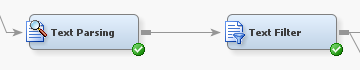 SAS Text Miner is used for analysing unstructured textual data. This type of data tends to be rather dirty, and to use unstructured textual data in a model prior to “cleaning”, may produce an undesired model. So my suggestion is to use the text parsing and text filtering nodes. These nodes help with “cleaning” the data by creating correct stop words and an abbreviation list, fixing spelling errors, properly defining synonyms and many other tasks. Once the data is clean then you can use the other point and click nodes of SAS Enterprise Miner to find the best model using the various algorithms, settings and options available.
SAS Enterprise Guide Tip
Once my data was prepared in SAS Data Integration Studio, I used SAS Enterprise Guide to query the data, create some new tables, and produce some charts. What I learned from this process is to continuously verify the modified/combined data. A complex query may produce unexpected values in your resultant table. This may be due to aggregating incorrectly or by specifying an incorrect formula or format. One method I found useful to verify the aggregation was to use the Summary Statistics task for measurements, to use a Line Chart for dates and a Bar Chart or One Way Frequency for category based data. Naturally the more familiar you are with your data the easier your reconciliation approach is.
SAS Visual Analytics Tip
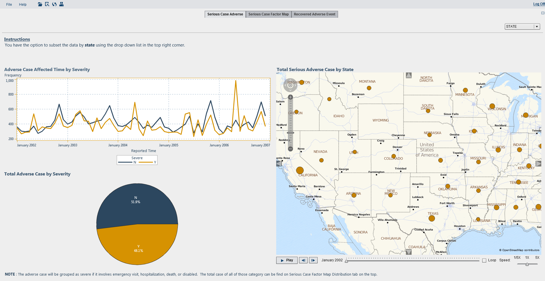
I found SAS Visual Analytics to be an amazingly simple, yet feature rich and powerful analytics product. I became familiar with SAS Visual Analytics Data Builder, SAS Visual Analytics Explorer and SAS Visual Analytics Designer. The SAS Visual Analytics Data Builder allows you to prepare the data and I found the interface to be easy to use with nice visualisation of the query logic. The SAS Visual Analytics Explorer component is great to explore data. With the autochart visualisation, you simply drag the columns you’d like to explore onto the workspace, and SAS Visual Analytics Explorer will determine the best visualization. SAS Visual Analytics Designer allows you to design reports as well as create custom graphs, which once again is easy to do with drag and drop. I was impressed by how little effort was required to produce a nice interactive report. Below is an example of a report I produced:
An area I found vital when creating the explorations and reports is to ensure the data items role is set correctly. Examples of data roles are: measure, geography, category, and document collection. By spending some time verifying the data roles before creating explorations and visualisations, allows the best visual to be chosen and prevents having to revisit the data items role settings afterwards. Some specific areas/tips I have are:
- If working with unstructured text to use document collection instead of category.
- If you want to produce a geo map, ensure you have a geography role assigned.
- If you want to show the groups in your data, set the role to category.
These 4 tips are things that mattered to me during my internship at Metacoda and I hope you found them useful too. If you have any comments or further tips in these areas, please share below.